With the summer break in top-tier professional football already in the past, 32 clubs from around the world are preparing to compete in the revamped FIFA Club World Cup, which kicks off this weekend in Miami.
The 21st edition of this international competition, which will be held in the United States from June 14 to July 13, will see clubs from six continents battle in group stages and four knockout rounds to be crowned world champions at MetLife Stadium in New Jersey.
The Manchester City is the current champion, after lifting the trophy in Saudi Arabia in the summer of 2023 after defeating the Brazilian Fluminense in the final. Both finalists are again among the contenders this summer, along with a large number of new uniforms from all the teams involved, some of which have been custom designed for the occasion.
As expected, there is a wide variety of t-shirts inspired by themes as diverse as historical monuments, local geography, folk art, Arabian mountain ranges, and even the South Korean electric power industry. We have analyzed each t-shirt and classified them accordingly.
The jerseys that will be used in the Club World Cup have not yet been officially presented, but rest assured that they will be added and classified when they are launched.
70. Ulsan HD – South Korea
Local jersey, Adidas

We’ll start with the most common uniforms, and Ulsan fits into that category. There’s really not much to highlight here: just a generic blue and yellow design to reflect the colors of the South Korean club, which first appeared on their crest in the late 1990s and early 2000s. It’s as generic as it gets.
69. Al Ahly – Egypt
Local, Adidas
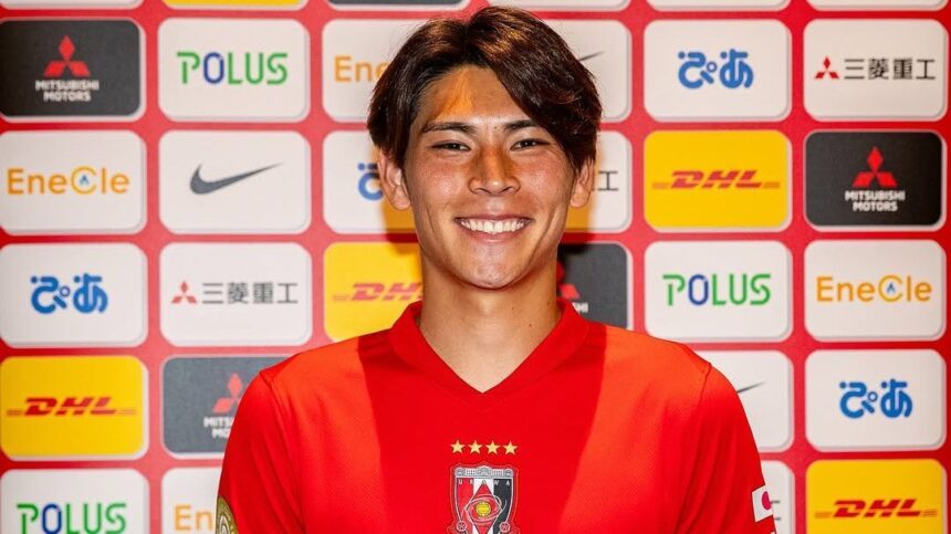
More standard Adidas designs, which could easily have distributed this same shirt to any number of teams playing in red and white. There appear to be no frills or details that make the kit exclusive to Al Ahly, apart from the crest, of course. Very disappointing and definitely a downgrade from the 2024-25 model, which at least had a scaled honeycomb pattern to liven things up.68. Urawa Red Diamonds – JapanLocal, Nike

Third, Nike
The same basic template has been recycled in Al Ain’s three kits for the Club World Cup, although for some reason the turquoise third kit has eliminated the triangular pattern from the sleeve cuffs, inspired by the mountain ranges of the United Arab Emirates, thus removing almost all the personality from the design.66. Auckland City – New Zealand
Local, Dynasty The current champion of the New Zealand National League and the OFC Champions League plays in a dark blue checkered shirt with minimal trim that has an unmistakable and unfortunate air of lower leagues. The club’s crest offers a good summary of the city, with stylized representations of the Sky Tower, one of Auckland’s most recognizable landmarks, and an anchor to symbolize the importance and maritime history of Waitemata Harbour, but that’s not enough to save it from mediocrity.65. Auckland City – New Zealand
Visitante y Tercera, Dynasty
Grouped because they are essentially the same shirt, Auckland City’s alternate kits are white and pale yellow, respectively, with the same checkered pillar running vertically down the center. It’s quite frustrating that their blue and orange Club World Cup warm-up shirt (seen above left) is the best of the bunch.64. Al Ain – United Arab EmiratesVisitor, Nike
To the left of the image from the previous Al Ain entry, the white variant of their three almost identical kits is shown, which have been created especially for the Club World Cup and which, however, seem to have very few specific features or flourishes of the tournament. We also have the horrible feeling that this third shirt will become completely transparent with the slightest hint of human perspiration, due to the strangely transparent appearance of the material.
63. Al Ain – United Arab EmiratesLocal, Nike
The new Al Ain home shirt for the Club World Cup is at least a very vibrant shade of purple and features the same fitted contour stitching as their other shirts. We’ll say the jagged tape pattern on the cuff is worthy of mention and is apparently inspired by the peaks of the Jabal Hafit mountains in the United Arab Emirates. It’s not an instant classic, but it’s a very narrow cut above the rest of the Al Ain group.62. Ulsan HD – South KoreaVisitor, Adidas

Visitor, Nike

60. Fluminense – Brazil
Visitor, Umbro
The iconic tricolor palette of Fluminense is once again cleverly implemented in their 2025 away kit, which is white with maroon and green trim. There’s nothing too ostentatious, but the asymmetrical underarm panels also feature an ornate pattern that is apparently inspired by various (though unspecified) elements of the club’s long history. The cuffs and V-neck have a nice stitched ribbed pattern and the abbreviated nickname “FLU” is stamped on the back of the latter.59. Boca Juniors – Argentina
Visitor, Adidas
The new Boca away kit (in the photo on the left) is part of the celebrations for its 120th anniversary and is a direct color inversion of its latest home shirt. It is a reference to the blue/gold and gold/blue band uniforms that the club used when it was originally formed in Buenos Aires in 1905. The shield has also been slightly modified with the addition of a star texture to the standard shield. Nothing extravagant or elegant, but it’s still a perfectly attractive kit in its own right.58. Paris Saint-Germain – FranceVisitor, Nike
A rarity these days, PSG is keeping its 2024-25 away kit and carrying it over to the new season, meaning the iconic Eiffel Tower will feature prominently on the Parisian club’s two main kits this season. The white shirt has a stylized silhouette of the Tower casually splashed on the front in red and blue and is a contemporary twist on a couple of kits worn by PSG in the late 1980s and early 1990s.57. Al Hilal – Saudi ArabiaLocal, Puma
Created especially for the Club World Cup, Al Hilal’s custom home kit is a collaboration with the New York-based streetwear brand KidSuper and therefore has a modern touch. The improvised stripes give the impression of being hand-painted and the shirt also features a large moon on the chest that reflects the Saudi club’s crest. There is a thin line between bold and ugly, and we’re not entirely sure which side of the division this shirt falls on.56. Al Hilal – Saudi ArabiaVisitor, Puma
The same KidSuper design is applied to Al Hilal’s away kit for the Club World Cup, with the colors changed from various blues to white and sand gold. Interestingly, the word “Hilal” translates from Arabic to English as “crescent moon”, hence the symbolic importance shown here.55. Botafogo – BrazilThird, Reebok

Visitor, Charly
The Pachuca away kit is dark blue with a hazy gradient added to the lighter stripes to provide contrast, although the effect only serves to elevate it slightly above the monotonous. As with the home variant mentioned later in the list, the neckline looks sharp and the 3D silicone club crest feels like something substantial and tactile in a world of flat vinyl-printed decals.53. Al Ahly – Egypt
Visitor, Adidas
Similar to Botafogo’s third shirt in that it implements a rough, graffiti-style graphic, Al Ahly’s away kit offers much more than the home equivalent in terms of conceptual depth. It is black with fluorescent yellow trim, but what the random white scribbles on the torso are supposed to represent is anyone’s guess.52. River Plate – Argentina
Third, Adidas

51. Palmeiras – Brazil
Visitor, Puma
The Palmeiras boutique kit is inspired by the triumph of the Brazilian club in the 1951 Rio Cup, an international tournament that featured important teams from South America and Europe in what can be considered a precursor to the current Club World Cup. Hoping to achieve similar glory with the current squad of players, they will head to the tournament with this KidSuper kit, a golden and soft green design with subtle baroque prints along the top and bottom. Undeniably clean, simple and classy.50. Benfica – PortugalThird, Adidas Not so much a third kit as an alternative variant of their new away kit, Benfica’s auxiliary change kit is a much brighter shade of white and sees the black trim aspect completely removed from the equation to create something that looks like a rudimentary training shirt. However, one must question the wisdom/sense of having two concurrent change shirts that are essentially the same color.49. River Plate – Argentina
Visitor, Adidas
The new River Plate away shirt commemorates the 50th anniversary of the club’s victory in the 1975 Campeonato Metropolitano and, as such, sees the Argentinian team return to stripes for the first time in several years. The design is crisp and clean, while the red and black bars are apparently inspired by a large hot air balloon that landed on the field of the Estadio Monumental during the title celebrations. However, once again, there is a strong smell of “template”, which is a shame for a shirt that is supposed to extol past glories.48. Ulsan HD, South KoreaThird, Adidas
Officially designated as a “special edition” kit, Ulsan’s third kit for 2025 is deep navy and gold. It comes with an unusual fractal pattern intended to evoke atomic nuclei and, therefore, announce the majesty of the energy industry. It was launched to commemorate the club’s annual “Brand Day”, first observed in 2023, in which Ulsan pays tribute to its owners, a large South Korean industrial conglomerate. The true spirit of football.47. Chelsea – England
Visitor, Nike
Chelsea will play in white away from home again next season with their away kit which has delicate thin green and red stripes in the middle in reference to the club’s old away shirt from 1974-75, the truly historic campaign during which the Blues suffered early eliminations from both national cups before being relegated from the First Division for the first time in over a decade. A baffling choice of reference, and the shirt looks like a rejected Portugal training shirt.46. Mamelodi Sundowns – South AfricaLocal, Puma
Another collaboration between Puma and KidSuper, the Sundowns have been given perhaps the most animated and lively of all thanks to the abstract representation of the golden sunsets of Tshwane in South Africa that fills the entire front panel. We definitely like what we see, but the total visibility will surely deter some people.45. Boca Juniors – Argentina
Third, Adidas

Third, Adidas
Late entrants in the Club World Cup as a replacement for Club León, who were dismissed by FIFA due to ownership issues, LAFC will play in their tried and true black home jersey, which was first used in MLS in 2024. The smart jersey has a regal tint by virtue of being decorated with alternating thin gold and “transparent” stripes, but the fact that it has been in use for more than a year is already playing against it in the freshness stakes.43. Palmeiras – Brazil
Third, Puma Launched as part of its 110th anniversary celebrations, Palmeiras’ third kit is a bright gold number with green details used to highlight the details. It also features a high-quality embossed version of the old crossed shield used by the club in its formation in Sao Paulo between 1914 and 1916, which is printed on the nape of the neck.42. Red Bull Salzburg – Austria
Local, Puma
Red Bull Salzburg has had the misfortune of being the recipient of what is surely the worst of all Puma’s mixes with the street fashion brand KidSuper. Supposedly a tribute to the beautiful and delicate symbolism of the edelweiss flower, the Austrian team will have to settle for a Club World Cup jersey that seems to have been pulled from the slime at the bottom of the Salzach River and left to dry on top of a pile of compost.
41. Monterrey – MexicoThird, Puma

Local, Charly
Launched specifically for the Club World Cup and with the look of something taken directly from the 1970s, Pachuca’s blue and white home shirt is a testament to the Mexican team’s previous forays into international competitions. Thin and uncomplicated, the very fine gold stripes on the shirt offer a little more luxury, but otherwise we must simply praise the retro-inspired moderation shown here.39. Botafogo – Brazil
Visitor, Reebok

Visitor, Puma
The Monterrey’s custom away kit for the Club World Cup is a creation by KidSuper that comes with a cloudy watercolor wash in light blues and whites that are inspired by the peaks of the Sierra Madre mountains of Mexico. Paint drips in the colors of the Mexican flag have also been allowed to drip from the neck, adding a charming touch.37. Benfica – Portugal
Visitor, Adidas The Benfica away shirt is, indeed, a color-inverted mirror image of the home kit, with a slightly creamy white base and red and white details used to create another relatively pedestrian design. There is a fine checkerboard pattern woven into the fabric, which at least offers some additional texture.36. Inter de Milan – ItalyVisitor, Nike
There’s something clearly medical about Inter’s new away kit, which features pale lilac crosses, misty grays, and mint green on a white background. It looks like a brochure produced by your local pharmacist to promote good gut health and overall well-being.35. LAFC – United StatesVisitor, Adidas
Launched in February, LAFC’s impeccable away kit is white and gold as a nod to the colors the club used during its inaugural MLS season in 2018. Additional details see delicate laurel wreaths added to the polo-style collar and slightly paler gold panels added under the arms.34. Flamengo – Brazil
Visitor, Adidas
The Mengão’s 2025 away kit is largely white, although the true conceptual details can be found on the sleeves. The feather graphic is supposed to resemble the wings of a vulture in flight, which has been the club’s symbolic mascot since the 1960s. In fact, their training ground and youth team headquarters is called Ninho do Urubu, which translates from Portuguese as “The Vulture’s Nest”.33. Red Bull Salzburg – Austria
Visitor, Puma
Much less ugly than the home shirt, Salzburg’s new away kit is positively subdued in comparison and yet features a distinctive blue collage-style print composed of samples of the alpine landscape and historical landmarks, such as the medieval Hohensalzburg Fortress and the sumptuous Prunksaal state hall.32. Bayern de Munich – Germany


